WYSIWYG
Introduction
Email design customization is performed using a convenient WYSIWYG editor, which is easy to understand even without any knowledge of HTML layout. Emails look equally good in all popular email clients and devices. It includes the following features:
- inserting images and image-links;
- setting up buttons;
- adding dividers between blocks;
- inserting text blocks;
- placing products;
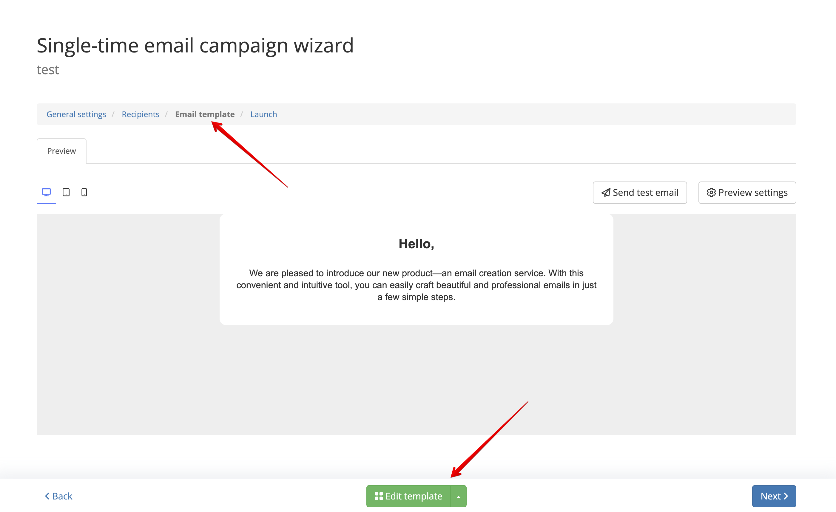
To work with the editor, go to the editing section of a bulk, trigger, or transactional campaign in the "Email Template" section and click the "Edit Template" button:
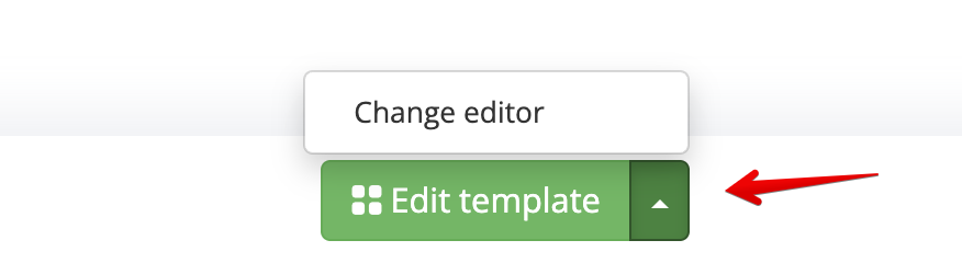
The dropdown button to the right of the edit template button allows you to switch the editor to HTML mode:
Description of Working with the Visual Editor
Overview of the Visual Editor Window
After clicking the edit template button, the visual editor page will open. On this page, you can compose an email for different devices, set the email subject, save changes, and reset the template:
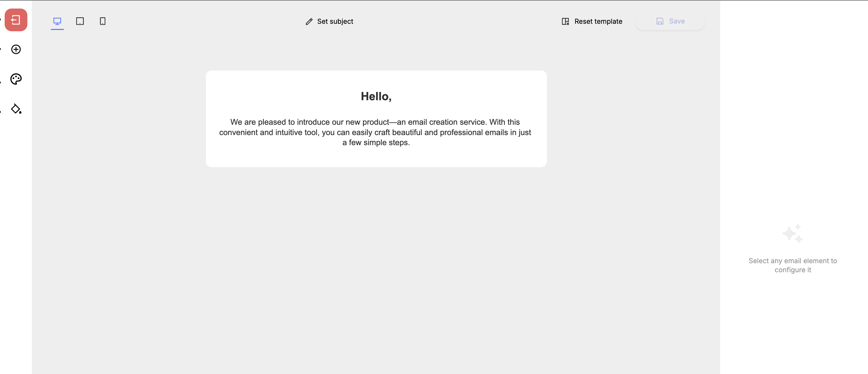
In the center of the screen, the email builder itself is displayed.
The left panel contains the following buttons:
- Exit — clicking this button exits the visual editor back to the campaign editing page in the "Email Template" section.
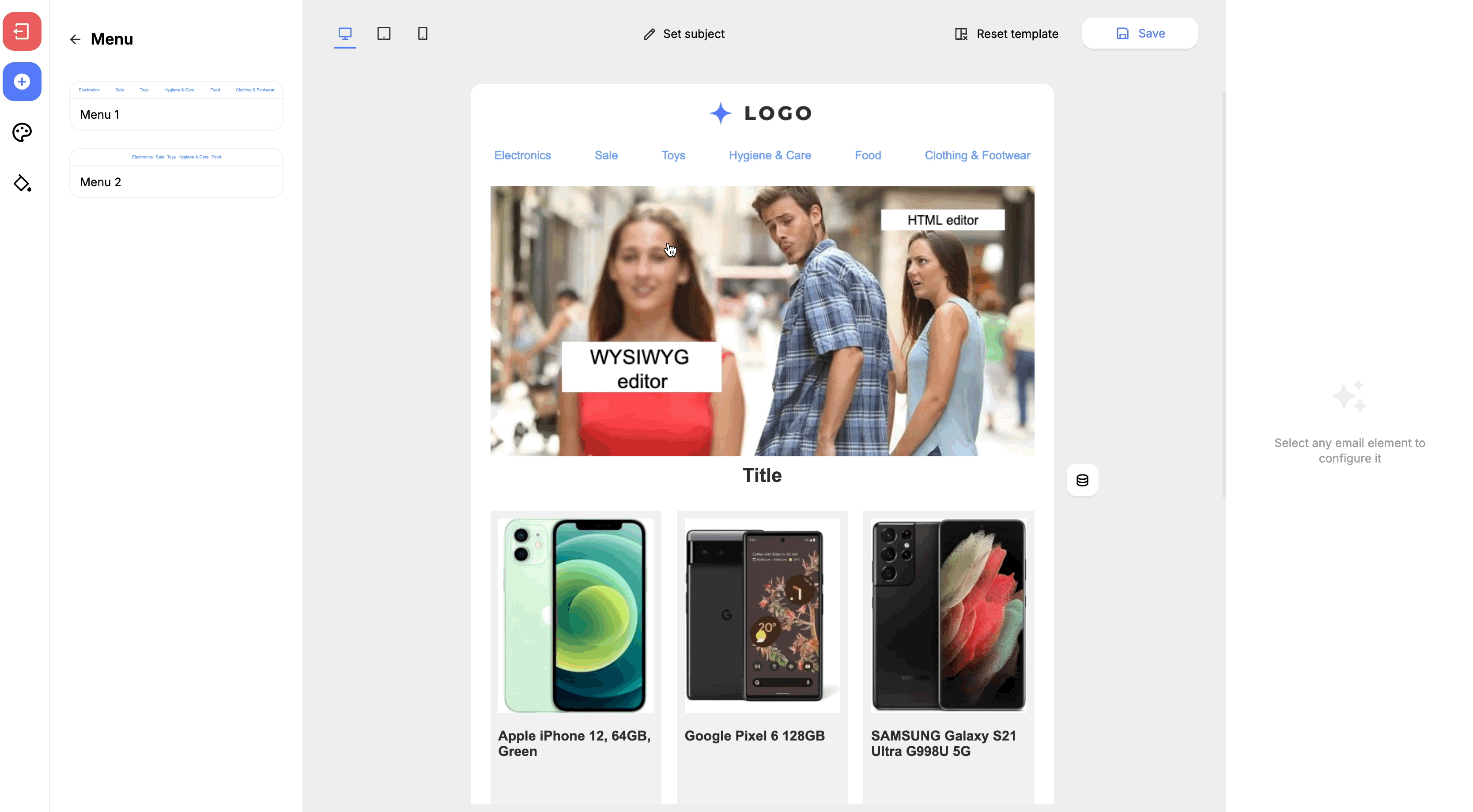
- Components — clicking this button opens the email components selection panel. Components are the blocks from which the email is built, such as: email header, text blocks, blocks with images and banners, recommendation blocks, and others.
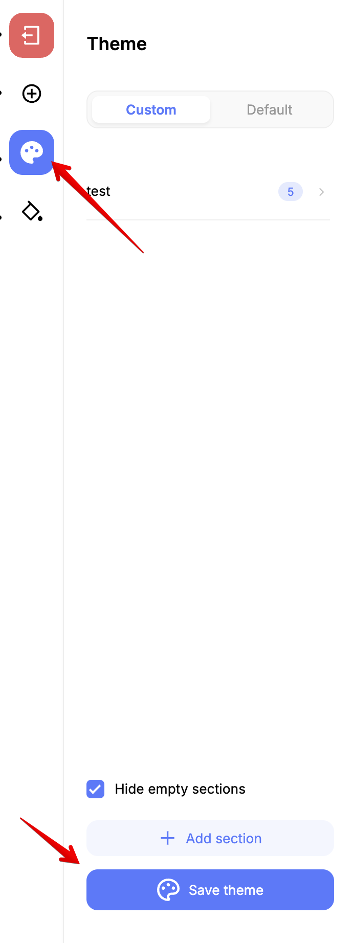
- Themes — clicking this button opens the themes selection panel. Themes change the overall appearance of the email, such as: background color, text font, font size and color, and more.
- Styles — clicking this button opens the email styles selection panel. In the styles panel, you can configure fonts, paddings, border radii, and colors for both the entire email body and individual components.
The top panel contains the following buttons:
- Device selection buttons — clicking these buttons selects the device type for which the email is currently displayed. You can choose between Desktop, Tablet, and Smartphone.
- Set subject — clicking this button opens a window where you can specify the subject and preheader of the email.
- Reset template — clicking this button resets the email template to its default state.
- Save — clicking this button saves the changes made to the template.
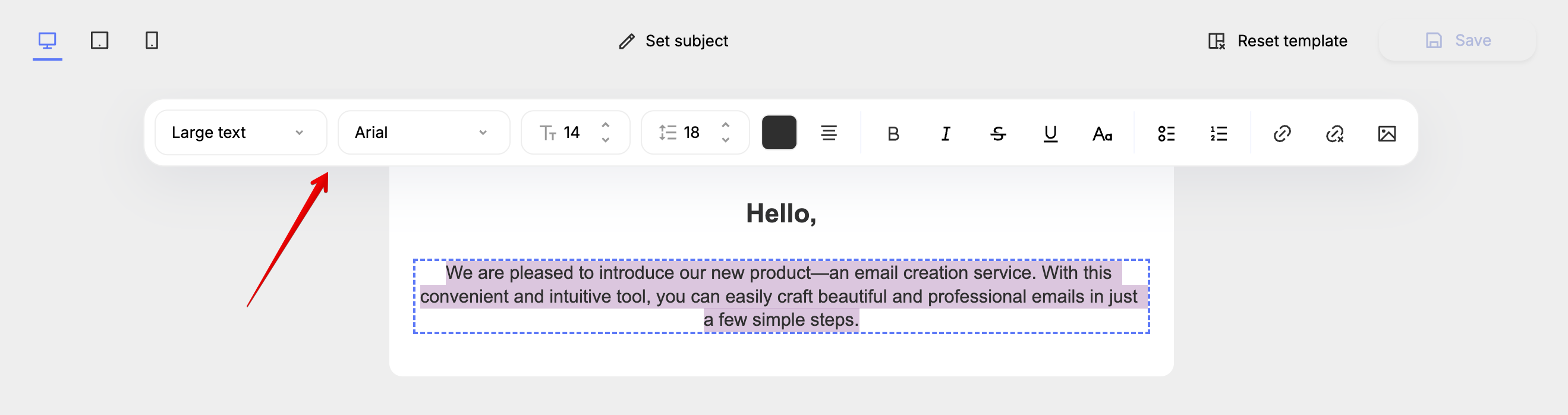
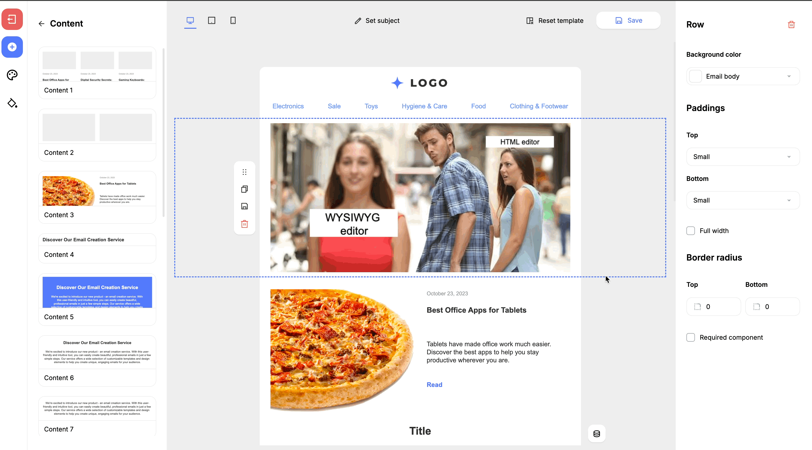
The panel above element displays the properties of the selected email components:
Creating an Email in the Visual Editor
To add new components to the body of the email, you first need to open the components menu on the left panel:
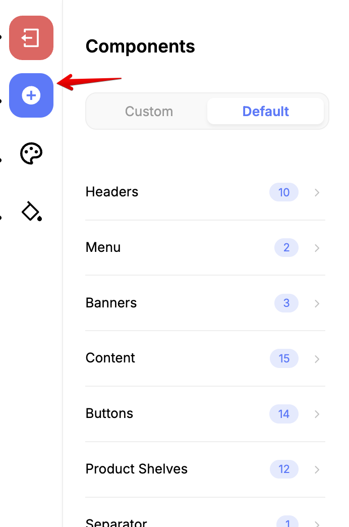
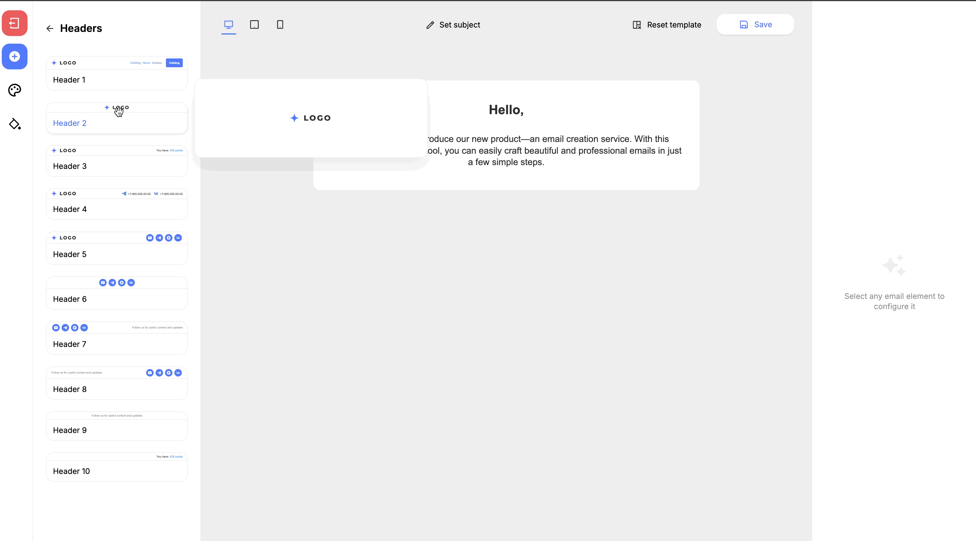
In the opened menu, categories of components such as banners, headers, text blocks, buttons, and recommendation blocks will be listed.
To add a component to the email body, simply hold it with the left mouse button and drag it to the desired place in the email body:
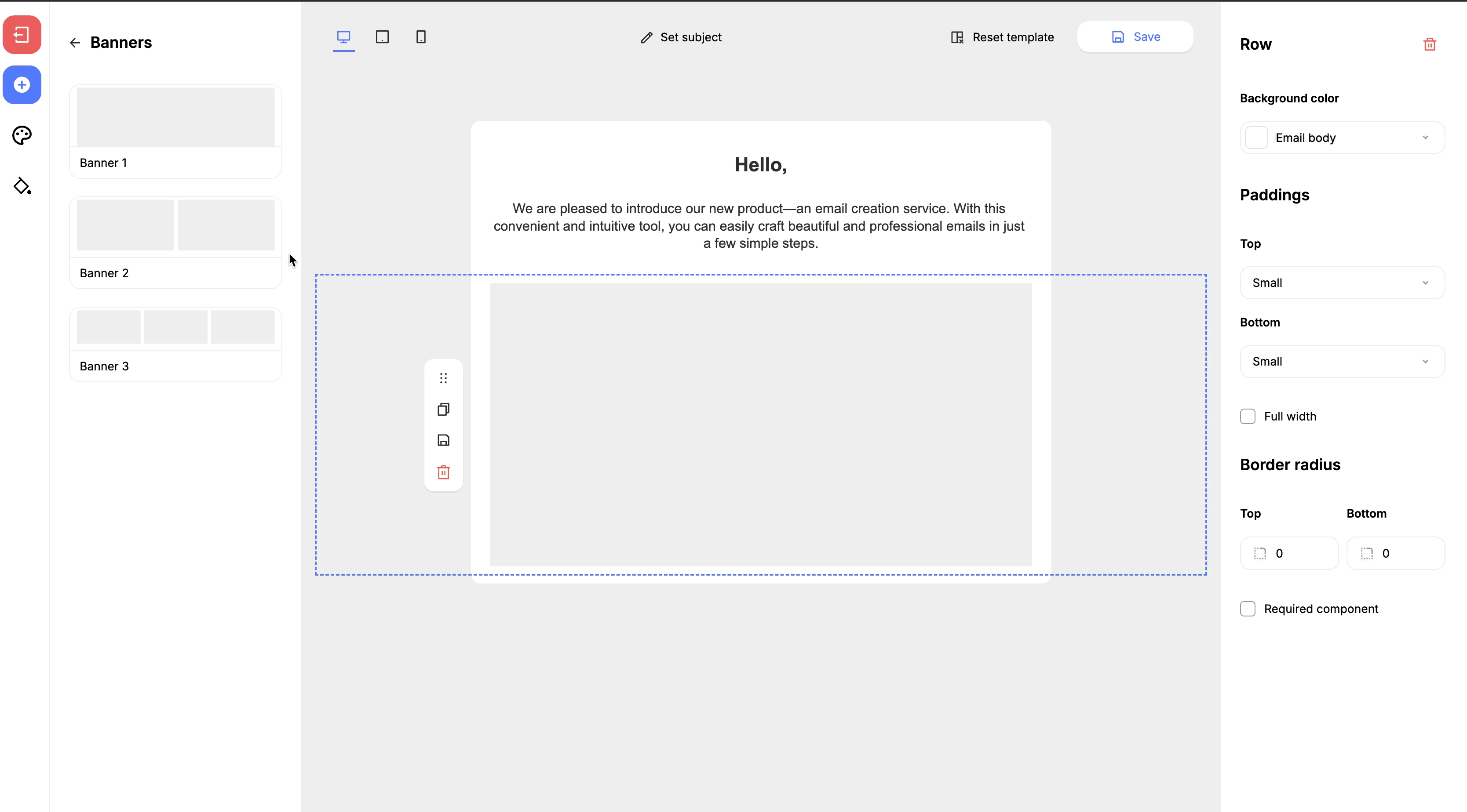
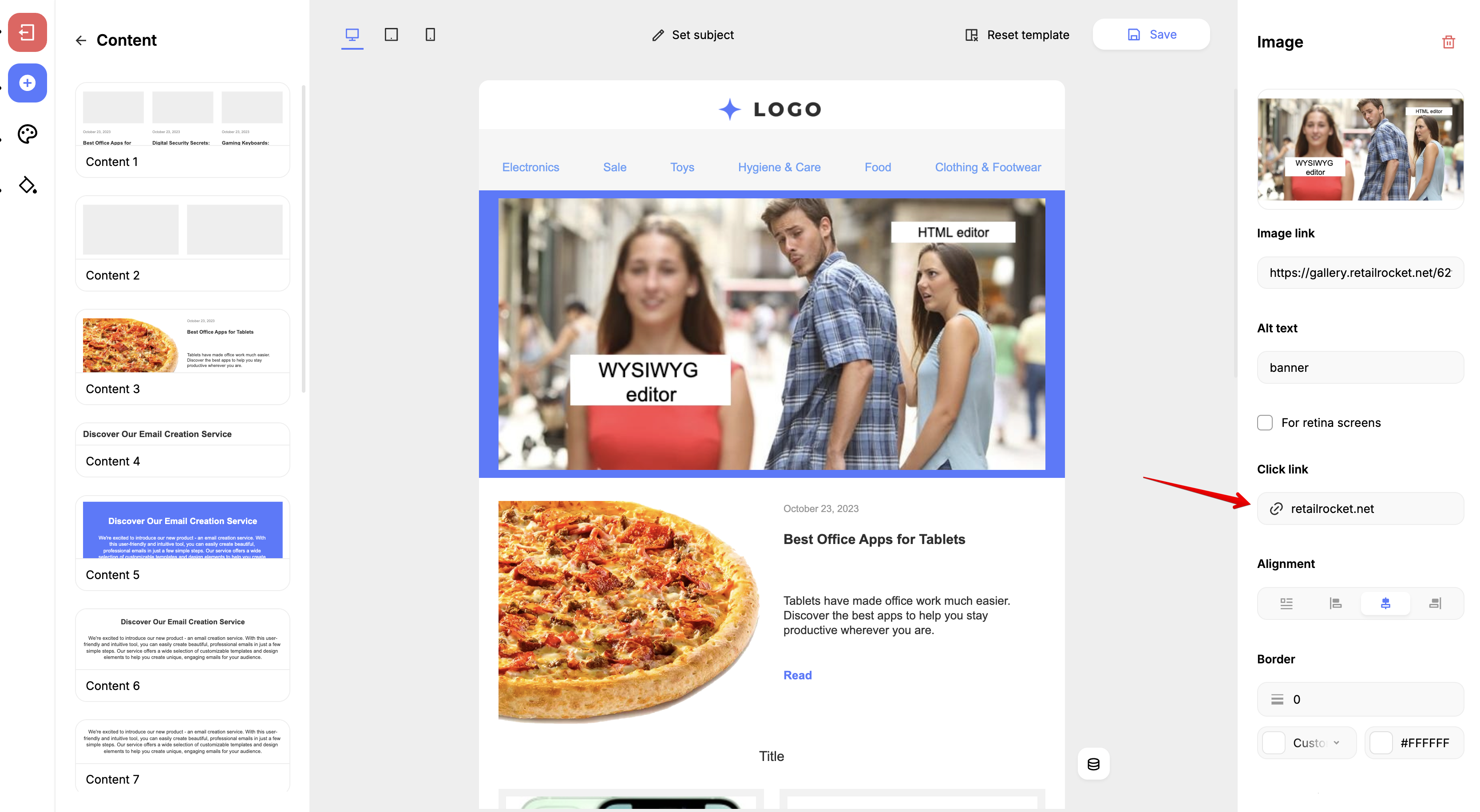
To change the properties of a component, such as the text of a text block, adding a link or a banner image link, you need to click on the component in the email body and change the desired property in the right panel:
When you click on a component, a context menu with available actions appears to the left of it. Among them:
- Move slider — moves the selected component to another place in the email layout by holding the left mouse button and moving the cursor. You can also move the component up or down using the arrows to the right of the slider;
- Duplicate — creates a copy of the component at the next level below;
- Save — saves the component in the components section;
- Delete — deletes the component from the email body;
Changing the Properties of Email Components
When you click on an email component, the component properties panel opens on the right side of the visual editor, where you can change the properties as needed. Let’s look at the functionality of this panel.
Email components can be deleted by clicking the trash button at the top of the component properties panel. You can delete both entire components and individual parts of components, such as block headings or text, if necessary:
You can set a custom display style for each component. The styles listed in the component properties panel are linked to the styles set for the email. Also, it is possible to set a display style for each component individually:
You can edit not only whole components, but also individual parts of components, such as images in recommendation blocks or buttons, headings, and text.
You can add a link to a banner or menu item in the "Other" section of the component properties panel:
Configuring Recommendation Blocks
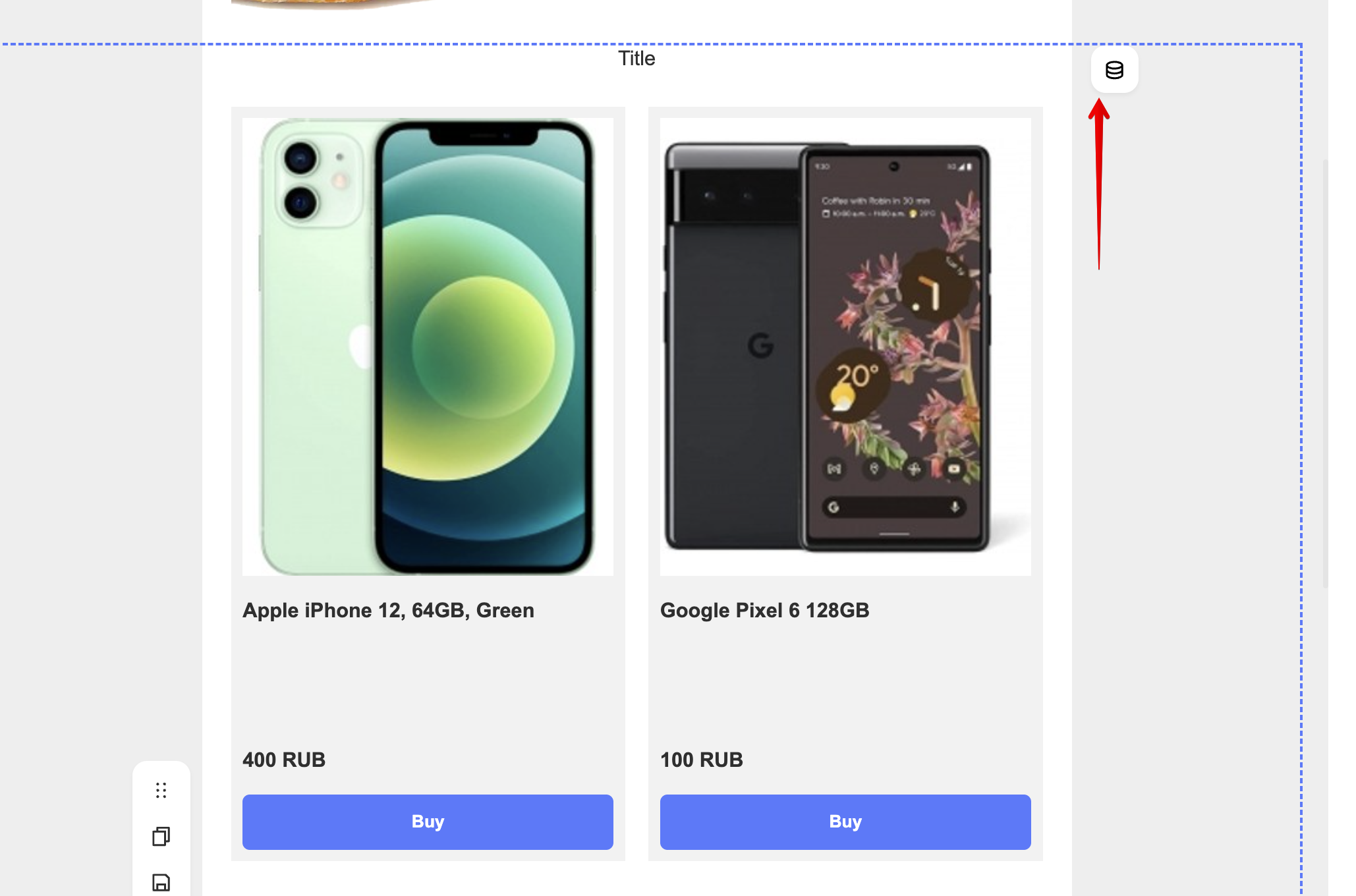
After adding a product block to the email body, a product block settings button appears to the right of the block:
Clicking this button opens the product block settings window:
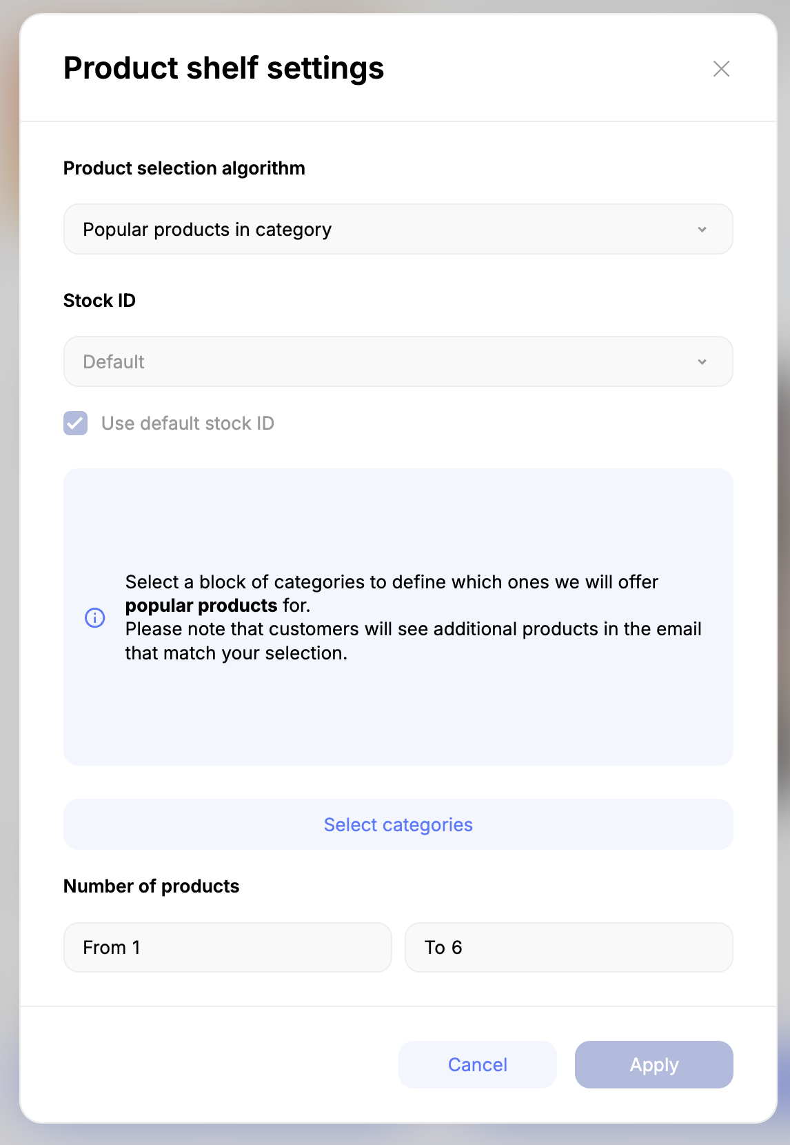
In this window, you can select the following parameters:
- Product selection algorithm — select the algorithm by which products will be selected in the block. The following algorithms are available:
-
- Product shelf
- Popular products
- Related products
- Product alternatives
- Popular products from the category
- Stock identifier — select the stockId by which products will be selected in the block
- Number of products — sets the number of products displayed in the block
In the middle of the window, there is a contextual section that changes depending on the selected algorithm. For example, when the “Product shelf” algorithm is selected, you can choose which products to display in the block. Or, when the “Related products” algorithm is selected, you can select products to which related products will be assigned.
To select products, click the “Select products” button. A window will open where you can find products by name or by their ID, as specified in the product database file:
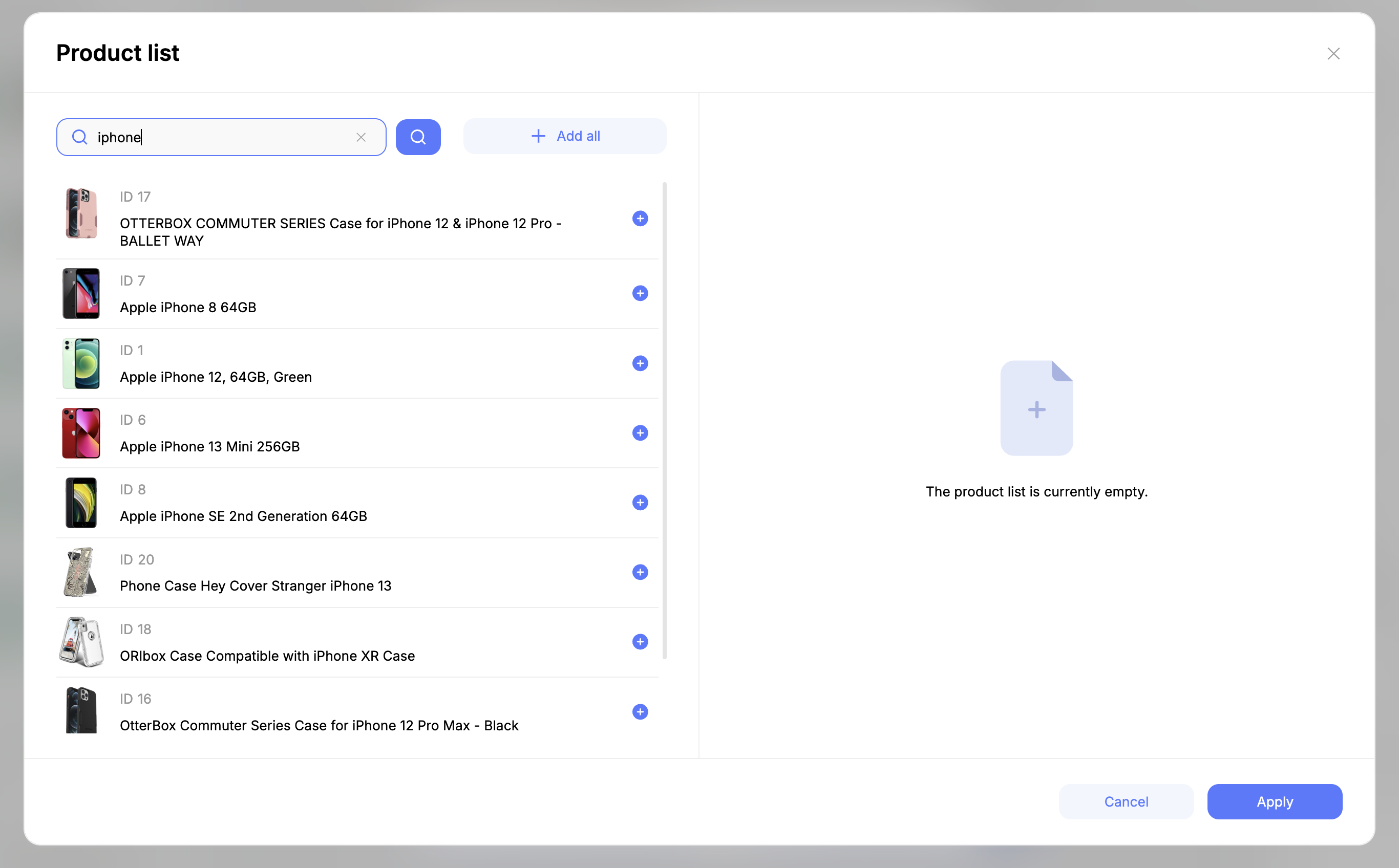
To add a product to the block, click the “+” button in the left section of the product selection window. To remove a product, click the “-” button in the right section of the window. The “Clear list” button removes all products added to the block. Save the selected products with the “Apply” button.
After selecting products, the selected products will be listed in the central part of the product block settings window. There you can change the order of products in the block and also remove unnecessary products.
Working with Email Styles and Themes
To work with email styles, you first need to open the styles menu in the editor's left panel:
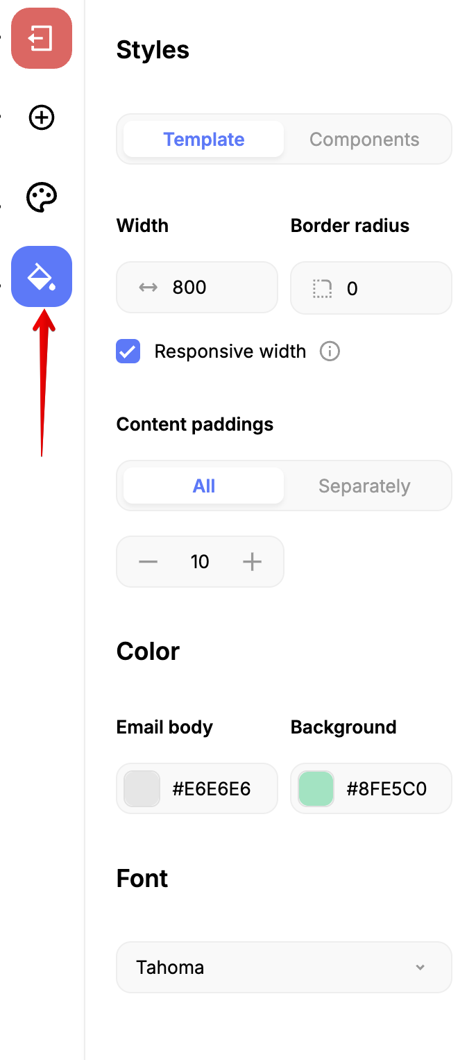
Styles can be configured for the entire email as well as for individual email components.
The configured styles can be saved as a theme. To do this, after configuring the styles, open the themes menu in the left panel, then click the “Save theme” button and select the theme group to save the configured styles to:
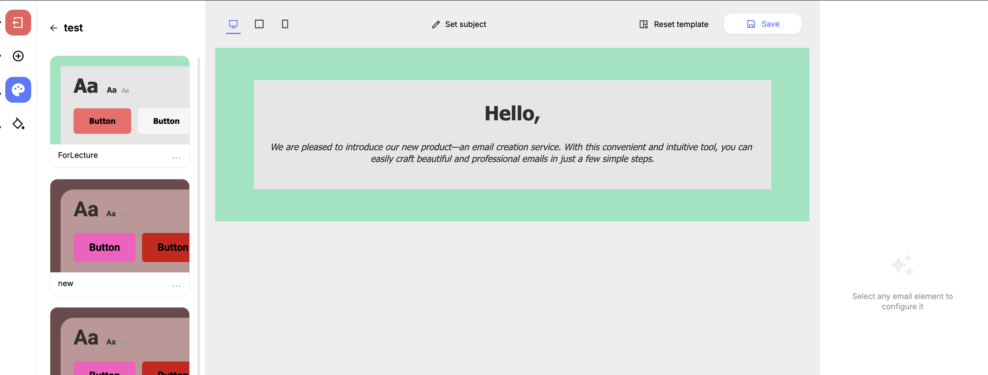
Selected themes are applied to the entire email:
Updated about 1 month ago